Resene shifts interior palette from rustic brick to deep wine tones
Color consultant Meryl Southey explains why saturated burgundies and plums are replacing earthy reds in bedrooms and dining spaces.
By Tomas Rahman ·
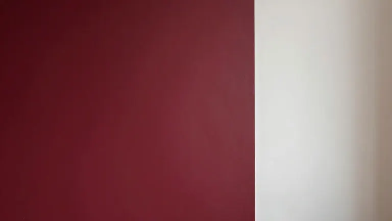
Homeowners seeking warmth in their living spaces are increasingly turning away from traditional brick-toned reds. The shift moves interiors toward richer, more saturated wine and berry shades. This change affects how people paint bedrooms, dining rooms, and sitting areas where they relax.
The color palette has deepened over recent years. Earthy, rustic reds like Resene Red Oxide and Fahrenheit are being replaced by moody garnets and plums. This transition reflects a preference for complexity over the flat, one-note look of older rust colors. The new spectrum includes specific hues such as Resene Rustic Red and Merlot.
Meryl Southey, a Resene color consultant, notes that red can feel daring to some homeowners. However, she says the color brings drama when paired correctly. The popularity of wine reds stems from their nuance. These shades offer depth that classic rusts lack, allowing for a more sophisticated interior atmosphere.
Southey advises homeowners to match the red undertone to their room's natural light. South-facing or cooler rooms suit warmer red tones. Naturally warm rooms can handle cooler reds without feeling overheated. The correct balance ensures the chosen color stands out rather than blending into the background.
For those hesitant to paint an entire room, feature walls remain a common strategy. A single painted wall, door, or piece of furniture in a deep wine shade provides visual weight. This approach allows homeowners to test the color's impact before committing to a full room transformation. It keeps the space open while introducing the desired tone.
Full color drenching is gaining traction in guest bedrooms and media rooms. This technique creates a deliberate contrast against neutral areas of the home. Resene suggests using soft, muted reds like Mulberry for these spaces. Adding touches of Dutch White or spiced green Pacifica can prevent the room from feeling enclosed.
Light absorption is a key consideration for deep reds. Saturated shades absorb light rather than reflecting it, which can make dim rooms feel oppressive. Southey recommends using tinted versions like Half or Quarter Merlot in low-light areas. This maintains the wine character while allowing more light to bounce around the space.
Pairing choices influence the final look of the room. Warm, soft neutrals like Half Tea or Biscotti prevent rich burgundies from feeling overly formal. Southey also points to emerging trends that combine reds with dusty blues and muted greens. Pairings such as Aroha with Duck Egg Blue or Staccato with Sea Fog soften the formality of the deep red.
The sheen level of the paint affects how the color appears. A velvety low sheen or flat finish enhances the richness of purple-hued reds. These finishes give the color a suede-like quality. Higher gloss levels intensify the hue and reflect more light, offering a different visual experience for the same base color.
Source: The Star